

THE BOOK THIEF
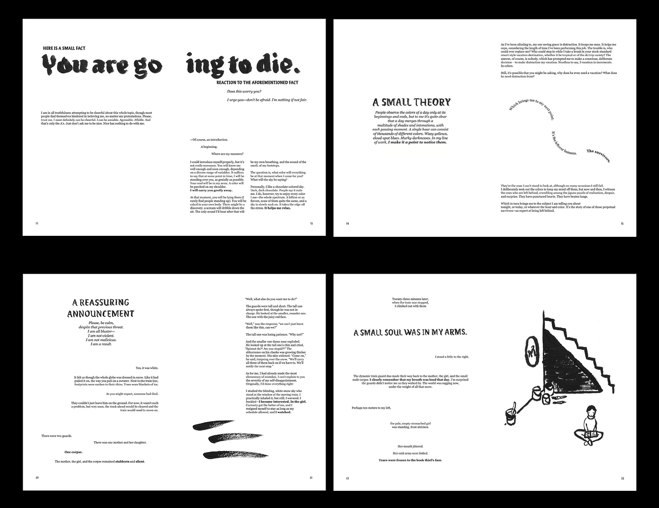
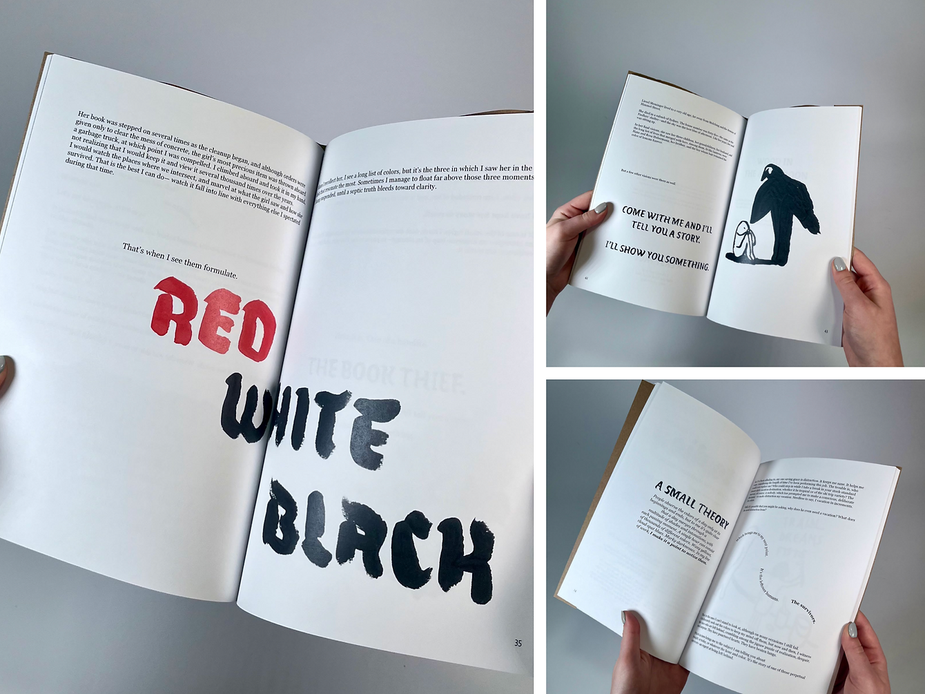
The typographic book design for The Book Thief aimed to capture the haunting yet hopeful spirit of Markus Zusak’s novel through expressive typography that reflects themes of death, literature, and love. Narrated by Death, the story follows young Liesel Meminger in Nazi Germany as she navigates a world overshadowed by war. This project employed typography as a storytelling tool, using carefully crafted type to convey the emotional weight of the narrative and to draw readers closer to the story’s characters and themes.

ENHANCE IMPACT
The design concept used unconventional layouts and visual interpretations of key moments to enhance each passage’s impact, creating an immersive, personal experience for the reader. Each page incorporated hand-painted watercolor illustrations and subtle textures, scanned and seamlessly integrated to evoke the novel’s somber atmosphere. Muted, organic colors and delicate brushstrokes were selected to enrich the design’s visual depth without overwhelming the story, allowing the illustrations to enhance rather than distract from the text’s message.


HAUNTING
BEAUTY
The approach to typography in The Book Thief extended beyond aesthetics, emphasizing restraint to let the narrator’s voice guide readers through the story. This process underscored the importance of harmony between visual design and narrative purpose, resulting in a book that honors the essence of the novel. By balancing haunting beauty with compassion, the project revealed how typography can amplify emotional impact, transforming a printed work into an experience that resonates deeply with readers and brings Zusak’s story to life in a visually compelling way.

Click through the slides to see how this project came to life!